Text
The Speaking Dashboard
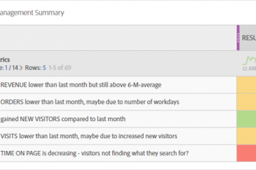
In Adobe Analytics Workspace you can create dynamic text which describes what happened. It is a table with custom text dynamically explaining your KPI. Don’t believe me? I will show you how you can create Read more…
Understand your stakeholders, be
empathetic and talk about objectives not metrics/KPI’s.
Build the Dashboard in the right structure (2/20/200), providing it in the right format with elegance.
There is not the one and only perfect dashboard. Customize it for your audience.
The idea for this one pager belongs to a Adobe Summit Breakout Session in 2018. We (Urs Boller and Till Buettner) tried to show a way to create the perfect dashboard. To archive the outcome for the future, this website was born


In Adobe Analytics Workspace you can create dynamic text which describes what happened. It is a table with custom text dynamically explaining your KPI. Don’t believe me? I will show you how you can create Read more…
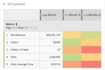
Are you looking for a great way to show a lot of information in a small table? At the Adobe EMEA Summit in May 2018 I presented a solution to create a summary table in Read more…
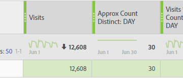
More than once I sent a report to a stakeholder and received a question like this: “I counted up the items of the table and it doesn’t match the total!”. But why? Either try to Read more…
A few days ago I wrote a blog post about creating a heatmap independant of segments and timeframes. At least I thought it is perfect … While adding the table to some dashboards I mentioned Read more…
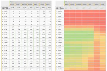
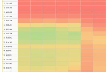
There are a lot of situation where you have a question like “when does something happen during a week“. One of the most common is the question about “when do we have the most visits” Read more…
As an analyst we are used to work with data every single day. we have no problems “reading” data and understand what they tell us. but is it the same for the stakeholders we send Read more…
Creating a dashboards is always like telling a story to the stakeholder. By adding some charts, tables and other visualization to a dashboard you can guide the reader through the data. Try to arrange the Read more…
One of the big challenges an analyst faces during the work is the overwhelming amount of data each analytics tool collects from the visitors. Even a simple implementation and some traffic on the page can Read more…