The Speaking Dashboard

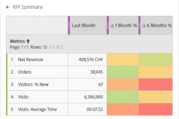
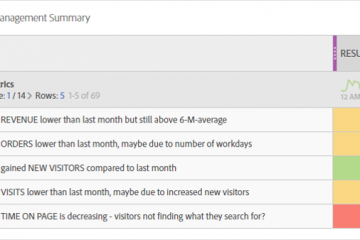
In Adobe Analytics Workspace you can create dynamic text which describes what happened. It is a table with custom text dynamically explaining your KPI. Don’t believe me? I will show you how you can create your own “Speaking Dashboard”! And Read more…

TEXT

As an analyst we are used to work with data every single day. we have no problems “reading” data and understand what they tell us. but is it the same for the stakeholders we send our dashboards? People are normally Read more…

CONTEXT

Creating a dashboards is always like telling a story to the stakeholder. By adding some charts, tables and other visualization to a dashboard you can guide the reader through the data. Try to arrange the tables and charts on a Read more…

RELEVANCE

One of the big challenges an analyst faces during the work is the overwhelming amount of data each analytics tool collects from the visitors. Even a simple implementation and some traffic on the page can already lead to quite a Read more…

ELEGANCE

Let’s introduce the 2-20-200 principal to you. I first read about it from Marco Hassler in his book «Web Analytics». It tells you to build dashboards in a way that you can see the overall situation in 2 sec, Identify Read more…

FORMAT

We as analysts do have our preferences, but do they fit to the business? Again talk to the stakeholders and ask them what suits them best. We have so many ways to deliver data. Urs and I love to deliver Read more…