Are you looking for a great way to show a lot of information in a small table? At the Adobe EMEA Summit in May 2018 I presented a solution to create a summary table in Analytics Workspace.
In this blog post I want to write about the history, basically why there was a need for such a table. But I will share some use cases as well to give you ideas on real world examples. And last but not least I give you some insights on how it works, just in case you want to use it.
Why we need a summary table
When I started using Adobe Analytics Workspace I was really excited about the possibilities I have. Drag and drop any metrics and dimensions in one single project. This is a huge change compared to the good old reports! Add anything you might be interested and see it all together.
Maybe due to the endless possibilieties our reports became long and longer. But there was one problem: our stakeholders are not interested in all the metrics and dimensions in detail. All they need is a quick overview at a first glance. And only in case something is not as expected they need more data.
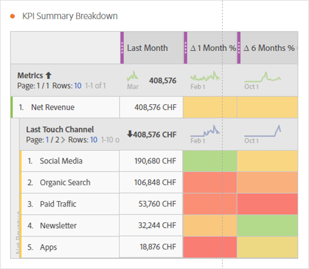
I want to give a short example on the problems in Workspace. If I want to show some basic information about page views, visits, bounces, unique visitors and similar metrics, I would add those to a single table. If business is interested in monthly and/or long term changes that add even more columns to the table. It may look like this:
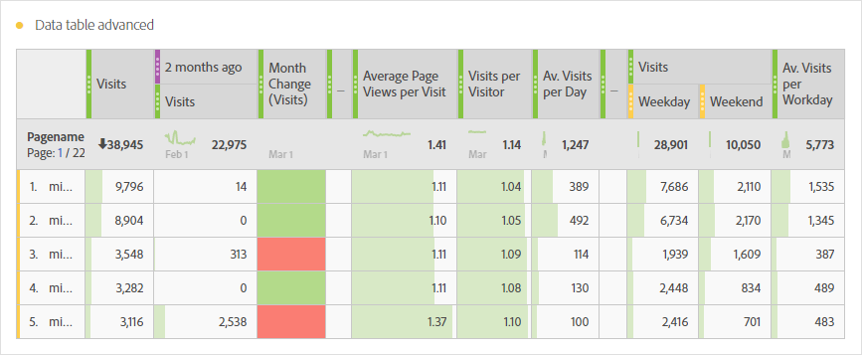
Basically for every metric (or set of metrics) I need another table. And this not only takes a lot of space, it is not the way the unused report reader loves. It would be best if there is one single table with the most important information at a glance, see one of my sketches I made:
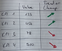
Basically I wanted a table with different metrics together with their “value” and an indication on short or long term trend. But because they are all calculated with other formulas you can’t achieve this with the OOB functions. After a lot of testing I finally managed to create a table, where you can display just any information you want! Be surprised about the possiblities you have with this tables!
Use case 1: “change table”
You can use the table to show any metric you want and have some “change indication” right beside the metric. In our monthly reports we have a monthly change and a comparison to a rolling 6 month average. The table might look like this:
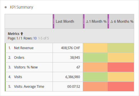
Having this table in a report makes it really easy to read even for people not used to work with data. They can immediately see what the result was and how it is compared to a short and long timeframe.
And don’t forget how useful it is for business to read the words they understand! In case people got problems to differentiate between visits and unique visitors, just use other words in the name of your calculated metrics!
Use case 2: “goal table”
In case you have real goals for single metrics (lucky you!), there is another great way to use the table. Instead of compare metrics over time, display the goal and an indication of the result. This table might look like this:
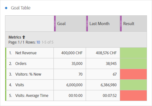
Add this table to a weekly or monthly report and your report reader can immediately see if they achieved their goals.
You skip data!
When I first showed those table to people familiar with data, the initial rection was like “why do you drop so much information out of the reports? We collect so may metrics and dimension and they are all very useful for the business!”
Be honest, are all those information really needed to get a first glance about the results? Just take a simple example: your goal was a net revenue of one million and you achieved 2 millions. Do you need any information like “time spent on page”, “bounce rate”, “average pages per visit” or similar before you open your bottle of champaign?
Yes, information are important. You need more than only report about net revenue. But I think those information are better used in deep dives than in a weekly or monthly (summary) report.
Good news for our “change table”: In case you need more details just add a breakdown. In our example you could breakdown the net revenue by marketing channels and have your results before the champaign is opened. Start discussion while you say cheers with the first glas:
And always remember: not reporting data does not mean it is lost! In case you need any more information you can still do more investigations on whatever might be interesting!
How it works
To create those table will take some time for the initial setup. The “trick” behind the table: find a way how a calculated metric outputs different results based on the cell. The following picture shows hot it works:
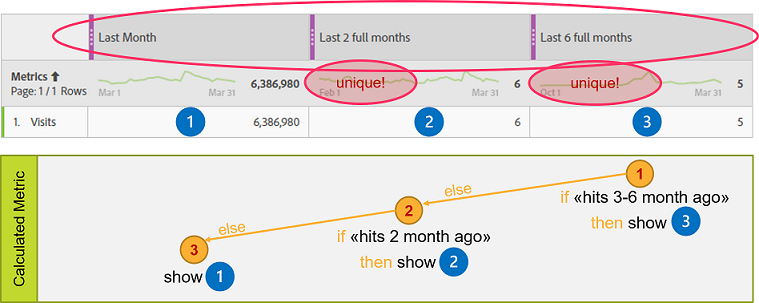
I used three different date ranges where two of them must have a unique time range. Within the calculated metric I have two nested if-conditions. Starting with a check for the unique time range (3) let me know that I am in the last cell. If not, I make a test for the second unique time range (of the remaining columns) to check for col (2) or (1).
I wrote a long blog post in the Adobe Forum where I explain in detail how everything works. In case you want to rebuild one of the tables above, just read the explanation there.
Recommendations
Just some remarks about the initial setup: I recommend that you invest some time before creating the first table:
- Think (and speak with report readers) what you want to compare, especially when you use the time comparison. What is your long time window and how should it be calculated?
- Define who creates the date ranges, segments and metrics. I recommend that you use a “team user” where you have no sharing enabled for the single items. One reason: Nobody will understand a time range called “Target”!
- Carefully test your metrics! Not only should you check your results at the initial setup. Also do some testing later on because the workspace results might change after a release (judt happened to me – don’t know if it’s a bug or not).
- Document all the calculated metrics you have or at least the underlying metrics/dimensions. This will help to understand the impact on any changes done in the tag management.
More ideas? let’s share!
There might be a lot more use cases where you can use those tables. I prefer using them basically on weekly or monthly dashboards to give business a quick insight on the main metrics. If you have other ideas or wish to know more, just let me know or add a comment to this post.
3 Comments
Neale Denton · 2018-08-22 at 6:00 PM
Very interesting post! How did you get the numbers to appear in the Goal column? Goal is purple suggesting it’s a custom date range, so how do you fix the Net Revenue goal to be 400,000 in this example?
Urs · 2018-08-23 at 8:02 AM
Hi Neale. The tables are created almost the same way. Use 3 custom date ranges (with custom text) and add the calculated metrics.
for the “Target” you can either use a “static number” or calculate something based on historic data. but be aware that you can only use hits within the date range of the column to calculate the value! that means if you want to calculate based on the last 6 month, your custom date range must be at least “last 6 full month”.
The speaking dashboard – Perfect Dashboard · 2018-08-12 at 11:10 PM
[…] way to create those metrics is quite similar to the “KPI summary table“. But in this solution, we just need two output values which makes it a lot […]