More than once I sent a report to a stakeholder and received a question like this: “I counted up the items of the table and it doesn’t match the total!”. But why? Either try to avoid those mismatches or explain it.
The problems with totals
As an analyst we are used to work with a lot of data. And we are used to create, read and understand even the biggest table which sometimes doesn’t fit on a screen anymore. It looks like it’s the bigger the better, isn’t it? And sometimes I get a great feeling the more information I have on the screen.
But what about our stakeholders? In most cases they are not used to read those tables. And they do not understand how even simple metrics work. All they see are a lot of numbers. And they try to understand – maybe even with the simplest math …
But what happens if those stakeholders have a simple table where the single items don’t sum up to the total? They might get confused and maybe don’t trust your data – a nightmare!
It is one of our main responsibilities to be as clear as possible when reporting data.
Explain common situation
One of the tables almost every stakeholder asked me about is a simple breakdown of unique visitors or visits. In most cases the sum of the single items don’t match the total. Here’s a short screenshot how it might look like:
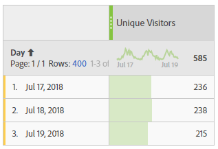
If the reader sum up the single days he has a bigger number that the total showed in the header. He might be confused, at least he doesn’t understand it without any explanation.
I don’t want to go into detail why they don’t match, I assume you as an analyst know the reason. In case you want read more, here’s an explanation from Adobe: Sum line item different from total
As an analyst you can try to explain those common situation in several ways:
- If you have sort of a glossary for your stakeholders, you can add those explanation right beside the metric (since most problems are directly correlated to the metric you use). In case a report reader faces a problem he can find the explanation right away
- Try to explain common mismatches in your training sessions. And at least one slide with an example from real life. This way the reader might remember and ask you before trust in data is lost.
- You can even add a short explanation right beside the table. This is very helpful if you know that your report is mainly for people not used to work with your data.
- And last but not least try to avoid those situation – in case you can. This is by far my favorite solution!
I’m sure there are more ways to help the readers but those are the ones I use the most. Feel free to add more ideas in the comments below.
Be careful with fancy metrics
As an analyst I love to work with calculated metrics in Adobe Workspace. The possibilities are almost endless – same for the numbers which might get displayed. But the fancier your metric is, the bigger the problems can be!
Based on own experience I recommend that you recalculate any numbers you have on your reports. Not only can you get a good feeling that it works as expected, but you might also see problems when the line items don’t sum up to the total.
Here’s an example of a report I created a few weeks ago. I tried to seperate different visits with a calculated metric. Everything worked fine until I was asked to add the bounces. Easy for me, isn’t it? But suddenly the lines didn’t match anymore! I had more bounces than visits (see numbers in the second line):
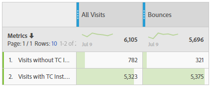
And even worse: I didn’t even notice until business asked me about the difference! Believe me, there are situation I love much more than this one.
Recalculate your own metrics to be sure they are right – or leave them out of reporting
Just in case your numbers don’t sum up, please follow the possible solutions I provided above. But it might be slightly different here: In most cases use the last option and try to avoid – because you might need a lot of time to explain. And sometimes that means to skip the metric out of the reporting or use a metric that is not absolutely perfect…
Understand formulas you use!
But even the best analyst is not save when he doesn’t understand the metrics. Problems might arrive somewhere you would never expect. This is especially true the more possiblities of different calculation you have.
I want to give you an example I faced a few weeks ago. With Adobe Analytics I created a bunch of metrics with the function “approximate count distinct“. This function basically tries to count the different items of a single dimension. I was really confident with the formula – especially in cases where i could validate the result really easy. For example, count the days in a specific timeframe always returned the right number – at least I thought. Just have a look here where I counted the days for the month of June (second column):
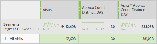
Using the formula in calculations showed a problem when numbers get bigger (especially with multiplications). Have a look at the right column: It doens’t match! (If you don’t believe me recalculate it yourself).
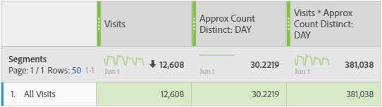
I finally found out that the problem is the function “approximate count distinct”: it doesn’t return an integer! Instead, there are hidden decimals you can’t see! Maybe because you don’t expect it? However, you have hidden the decimals and you can’t see them! But they are here and will be used in the calculation. If I show you the full value, the calculation suddenly match:
Remark: In this case you can use a “round” function to get rid of the decimals.
Don’t use fancy metrics if you don’t understand how they work
Yes, it is just a simple example. But it shows that you should understand the formulas used in metrics and carefully recalculate your results. Sometimes it’s worth using the good old pocket calculator. And in case you found a mismatch, try to understand the outcome! Maybe you can solve it really easy…
Create trust in your data
In this article I explained why it is worth to recalculate your data. Not only you can be more confident about the metrics you use, you might also find mistakes or problems in your calculation.
Add explanations to your reports to build trust over your data
And in case you can’t get rid of some mismatches, either explain them to the report reader or skip the data from reporting. All those efforts you make will help building trust and confidence in the data you present to your stakeholders.
0 Comments