In Adobe Analytics Workspace you can create dynamic text which describes what happened. It is a table with custom text dynamically explaining your KPI. Don’t believe me? I will show you how you can create your own “Speaking Dashboard”! And I promise, it is very easy to create!
Basically the “Speaking Dashboard” is a table which show you textes what happened on the website along with a color indication if it’s good or bad. Have a look how the table might look like:

At the Adobe Summit EMEA 2018 I presented this solution of the “Speaking Dashboard” during the Analytics Rockstar session. In this article I will share some deeper insights on how to get this table to your own dashboards in Adobe Analytics Workspace.
Why a speaking dashboard?
When I saw the tip from my friend Till Büttner @oarsi at Adobe Summit 2017 winning the Rockstar contest I was amazed by the idea. How great would it be to offer dynamic text in my dashboards! Unfortunatelly, most of my dashboards are in Workspace and the solution provided was created in Excel.
As Till mentioned in his presentation, it is far easier for people to read and understand text compared to numbers. Just imagine that the report reader does not have to compare numbers! Just read the text and know what happened! That is the reason why I tried very hard to figure out a way to create something similar in Workspace. But there is no out of the box solution offered by Adobe – not yet…
How it works – a first insight
The trick is that I don’t really just add the sentences which describe what happened. Instead, I have a lot of sentences in the table. And all are describing different things what might happen on the website. And together with a hidden ranking system, the right sentences will show up in the output.
Hard to describe just by words, so lets see a very simple example for revenue. Instead of looking back what happened, I think about the future and what different cases might happen. For each of those cases I create a new calculated metric with a nice description, a color for the visualization and a calculation for the ranking system. That’s how my different metrics for “Revenue” look like in the table:
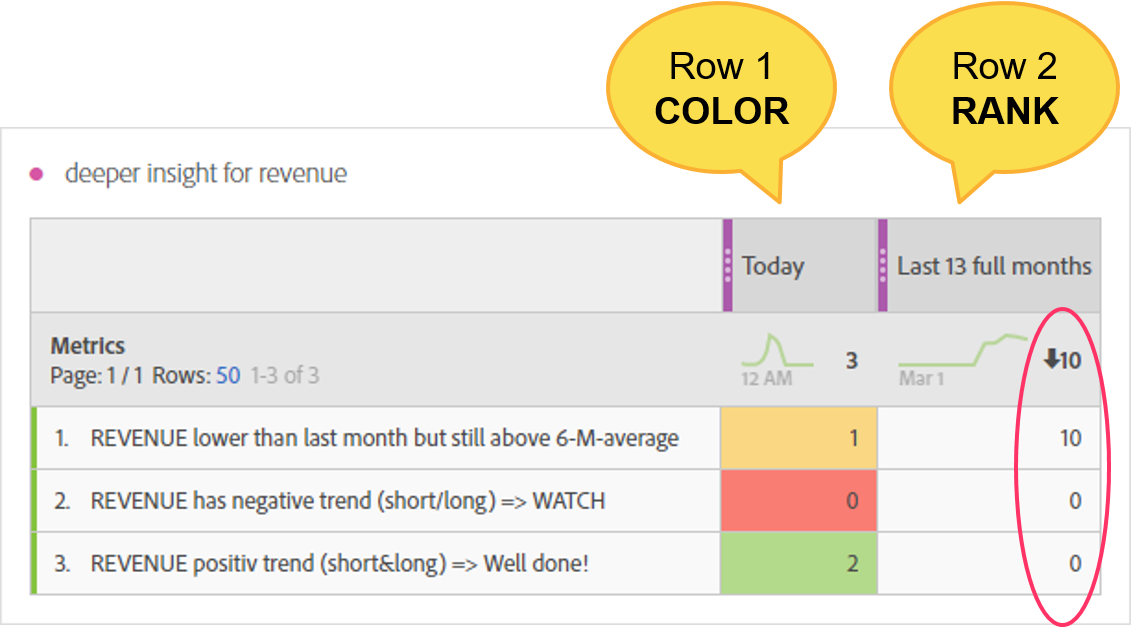
You can see that all metrics show a static number in the first column (color). In the second row you can see that only one metric has a positiv value. Strange? Not at all, this is the way you can order the right sentences in the ranking system.
The hidden ranking system
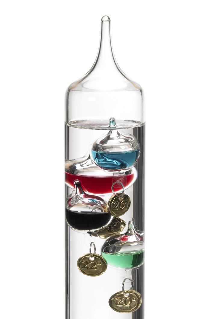 As already described the second row is used as a ranking system. You can compare the function with a galileo thermometer: Maybe you know how it works. In a fluid you have different bubbles all describing the same: the temperature. And based on the environment the right bubble will appear at the top.
My ranking system for the “Speaking Dashboard” is almost the same. If I create a few metrics for the same, only one metric will output a positive value in the ranking column. If you have a closer look at the example with revenue above, you can see that only the metric with the valid sentence has a positiv integer. If a sentence (or the condition behind) does not match, it will return zero.
In my final table I just add a lot of different sentences describing all kind of metrics. I just need to make sure, that at least any 5 sentences are right at any given time (or more, depending how many sentences you want to display). Or back to the galileo thermometer: Only looking at the top gives you the right temperature while all other bubbles stay below.
Why two columns?
You might ask, why I use two columns in my table. Why not create a solution with only one column, containig the color. There is one main reason why I decided to have the ranking system disconnected from coloring in a seperate (hidden) column.
If I have the ranking system seperate, I can make my ranking based on any system I want. And that can be completely different from the coloring system. This allows me to have those metrics on top which are the most important for the business. And having two columns the ranking is regardless of the coloring!
The hidden ranking system has the advantage, that I can decide for every single sentence the color and ranking. This gives a great flexibility compared to a single row ordered by color.
Creating the calculated metrics
I wrote a lot about the table and columns, time to look at the sentences itself. Each calculated metric has two outputs: First, a number that indicates the good/bad (in my case I use 0 as “bad”, 1 as “ok” and 2 as “good”). Second, a positive number for the ranking system – but only if the condition for the sentence is true.
The way to create those metrics is quite similar to the “KPI Summary Table“. But in this solution, we just need two output values which makes it a lot easier.
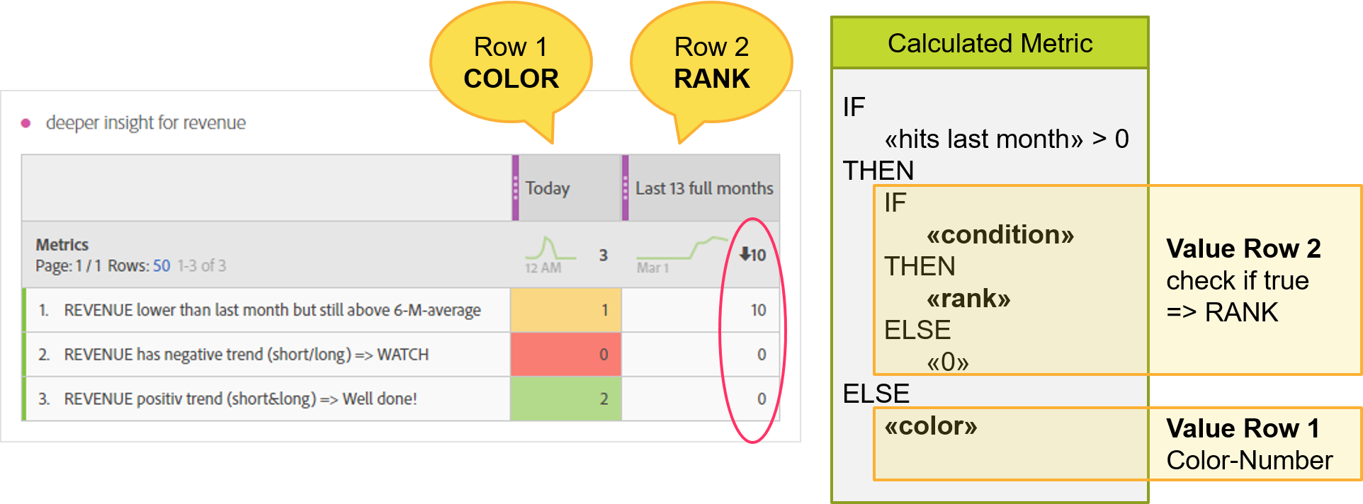
In the picture above I show you the basic scheme of the calculated metric. I have an outer “if then else” formula to check in which column the output should be.
Within the “then” I make another check (inner “if then else” function) to see if the sentence is true. If yes, it will output a static number for the “rank”, if not, the output will just be “zero” to get it at the lower end of the final table.
The “else” from the outer formula is just a static number for the desired color.
Thats all! Just create a bunch of sentences and add those to your table.
Remark for professionals: the system would allow me to even add a multiplicator to the ranking based on the site section the report is made for. All I need is a good classification system and an additional formula. Having this would bring revenue to the top where it really matters – and nowhere else! But this might be a topic for another article…
Setup for the table
You can see the setup for the table in the screenshot above. I use two custom date ranges for the columns.
The first column “RESULT” is a date range for today. It doesn’t really matter what you choose. But it most be different from the very first condition you have in your calculated metric (“last month” in my case).
The second column “RANK” is a date range for a longer time period in the past. Be aware that it must be very big. At leadt it must contain all data you want to use for any checks! If you want to calculate anything for the last year, the date range must be as long as you need it.
Advanced sentences
Until now, I just showed the example for revenue. I’m pretty sure that you can imagine a lot of other metrics you want to describe and add sentences. My first picture in this article shows you some ideas what you can add:
Let’s give you some hints what you could do more.
“Houston, we have a problem”: You could add one metric to the table which outputs always “0” for your ranking. As soon as you have an issue with your data, just give the “rank” a high number. Now a text like “We have a problems with our data – please give us time to fix” might appear at the top of the table.
“Quarterly or early conparison“: You could add an additional condition and check if the last month was the end of a quarter or the end of a year. Using the table in a monthly report would let you now, that you can compare some quarters or years. Just give the ranking a high number to appear above the monthly sentences.
“Happy birthday“: You could even check what day was yesterday when it is used in a report. Now add a sentence to wish somebody a nice day if he reads the report – or whatever you want to say…
I’m sure there are a lot more ideas on what you can do with this table. Just give it a try and let me know about anything you find out!
0 Comments