As an analyst we are used to work with data every single day. we have no problems “reading” data and understand what they tell us. but is it the same for the stakeholders we send our dashboards?
People are normally not used to read numbers alone, we prefer reading real text. if you create a dashboard try to add as many text as needed to help the stakeholder understand what you’ve done.
there is not the one and only way to add text to a dashboard, neither I have any guidance on how much you should write. again, it all depends on the people.
I try to give some examples what might help the reader understanding your dashboard.
You can add text as a summary or introduction to a dashboard. this might help new readers to understand the content of a dashboard. but try to keep it short since the stakeholders just read them at the first time – afterwards it’s just a waste of space.
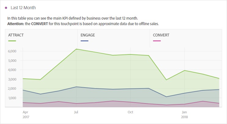
If you have any charts, you might add a short description as well as anything special the reader should be aware of.
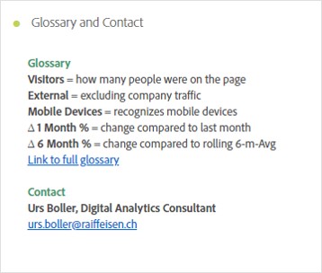
what I recommend is adding a glossary and contact information to every dashboard. you can add the glossary either directly by explaining some words or metrics used in the tables or adding a link to any webpage, maybe a central repository. Just in case anyone has a question, a contact information helps to get in touch very fast. maybe not only add a contact for the analyst, but also a business contact – maybe who is responsible for the website or app.
0 Comments