There are a lot of situation where you have a question like “when does something happen during a week“. One of the most common is the question about “when do we have the most visits” or “when do we get the most orders”. Or you can receive the oppsite question asking for the lowest visit timeslot maybe when IT is planing an update of the website.
Some years ago this question was solved by download raw data and categorize every hit/order based on the weekday. The result was a simple table where we used to add colors based on the single cells to show highs and lows.
At this point I want to give credit to Jen Lasser from Adobe Product Management who presented the basic table at the Adobe Insider Tour (see Adobe Analytics Tips). And I want to thanks both Jen Lasser and Till Büttner for your inputs while writing this article!
Adhoc Table in Adobe Analytics
A few month ago Adobe added the time parting feature to every implementation. This new feature basically adds some dimension based on the timestamp for every hit to your data, eg. day of week, hour of day and more (Adobe documentation about the Time-Parting Dimensions). Those dimension can be used to quickly draw a table which shows a single event (like visits or orders) broken down by “day of week” and “hour of day”. Now just remove the numbers, add custom conditional formatting and you have a table which looks like this:
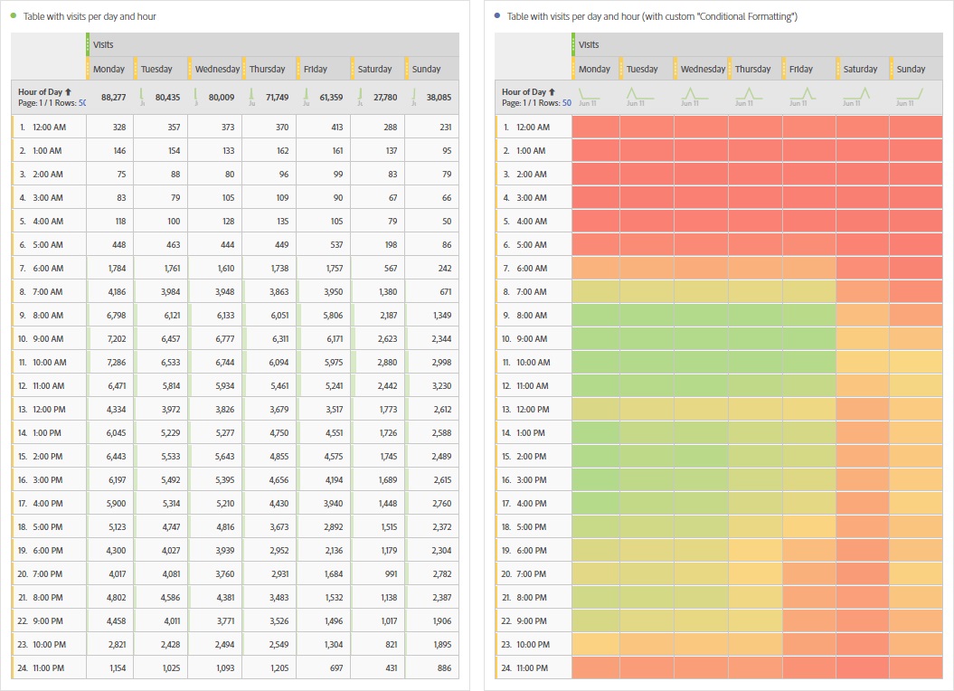
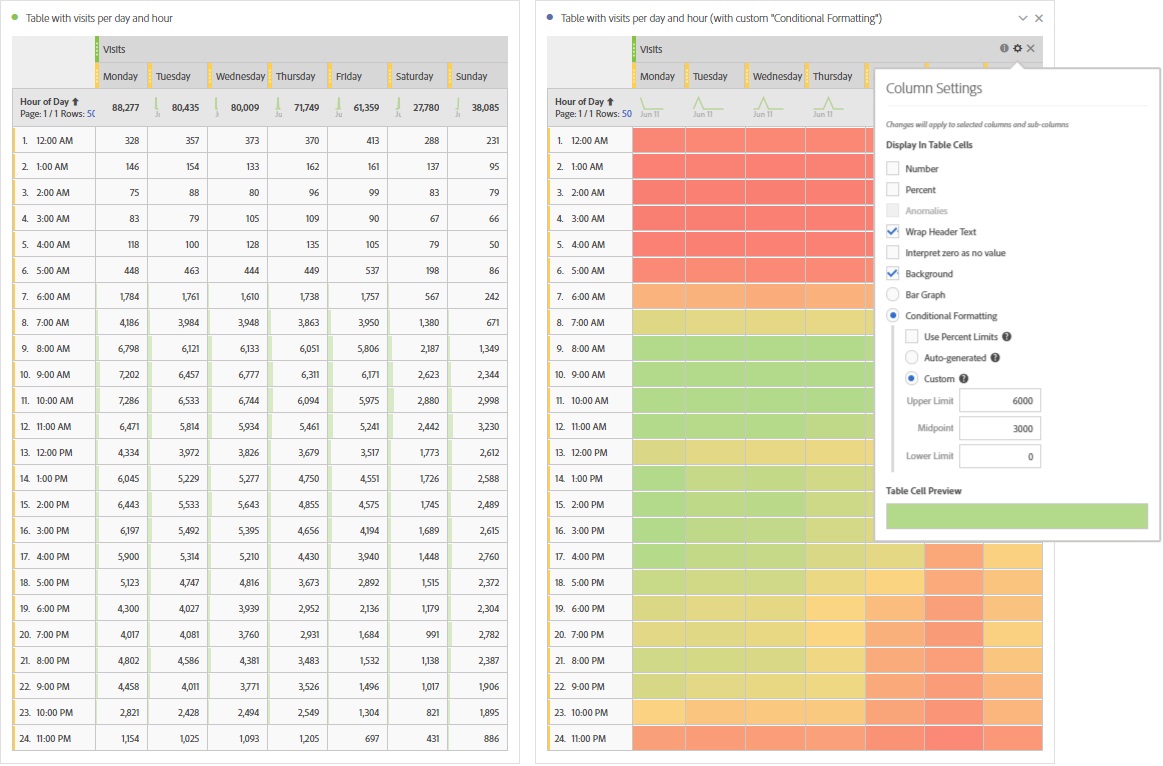
This table is great to get a quick insight on a specific metric and how it happens during a week. Remark: Just in case you don’t know how to turn off the numbers and only show the conditional formatting, here is how to do it: select all cols (by holding “shift” on PC or by select the top metric “Visits”) and click on the little gear icon. Within the small menu you can change the settings for the selected rows, for example change the background to “custom conditional formatting”:
But there are some problems as soon as you want to use it more than once:
- The conditional formatting is based on exact numbers. As soon as you use another metric, add a segment filter or do anything else that affects the numbers, you need to change the boundries for the conditional formatting.
- If you don’t have one full week as timeframe, you might give more credits to some days. For example if you look at a full month, it is possible that a Tuesday occurs 5 times while you only have 4 Mondays. This would give those days more chances for events to happen than others.
In the next parts I will show you how you can get rid off those limitations and create a fully automated and flexible table for your dashboard.
Improved heatmap 1: daily spread
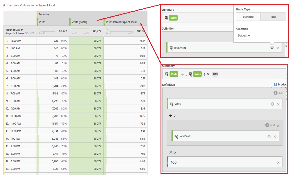
You can remove both restrictions above by changing to relative numbers. That means that every cell of the table should show a percentage which represents the result comparing the current value with the total (of the corresponding day). Basically you need the percentages which are shown beside the numbers in the original columns. Unfortunatelly you can’t get them by default, so you need to create a new calculated metric and do the calculation on your own. The following picture shows how you get the “Total” of the visits for one day as well as the “Percentages” which are the “Visits” divided by the “Total Visits”:
Adding this metric to the table above will replace the numbers by the desired percentages. Now you can change the conditional formatting to match your new boundries and the table will look something like this:
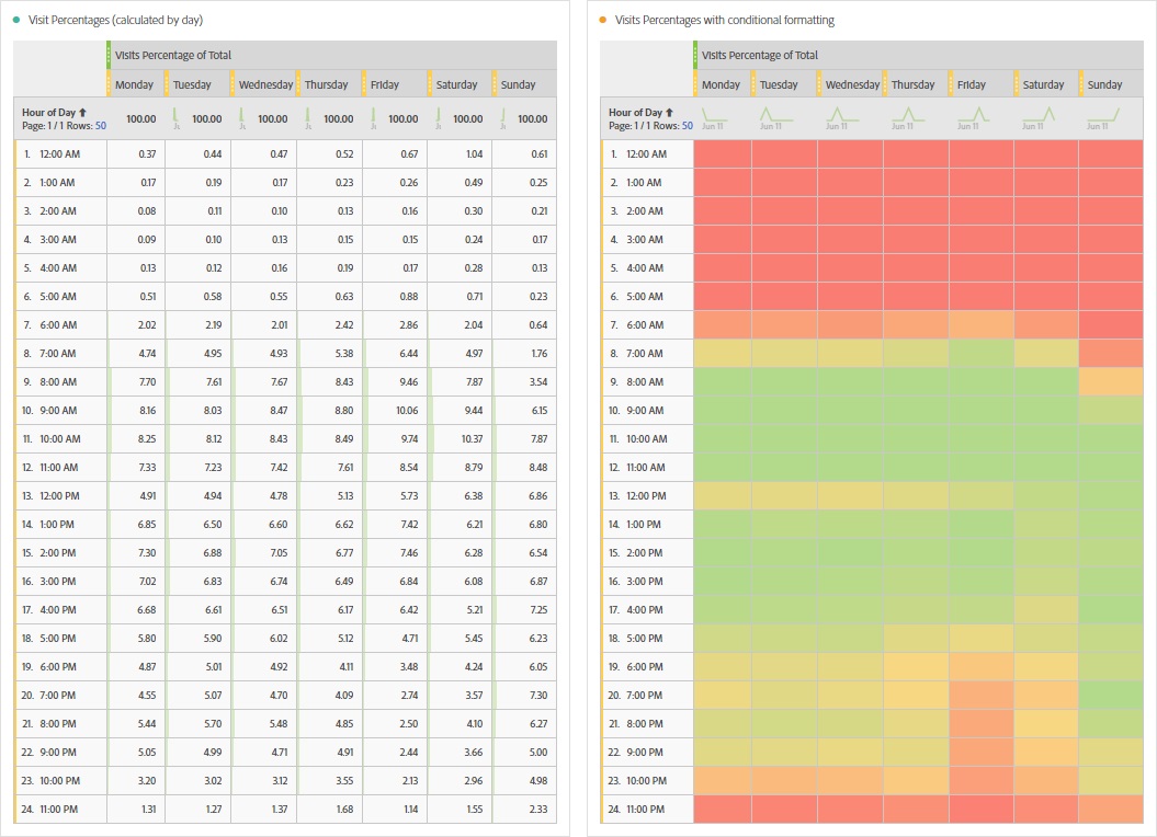
Looking at this table will show you how the metric is spread for the different days. But you still face a limitation: the calculation is made seperate for each day because the „Total“ is calculated seperate for each single day (and not the whole table). The reason for this is that there is a dimension item in the header and therefore filtering the elements in the column below. But you can still use this table if you are interested to see how the metric is spread for a single day of the week.
Improved heatmap 2: overall spread
You can further improve your table and try to calculate the percentage based on the total sum of the table. The first problems are the dimensions in the header columns. By having those dimensions, all data in the column is filtered based on this dimension (see above). To get rid of this limitation we need to find another way without dimensions in the header columns. The solution is a calculated metric which contains the desired dimension (as a segment) within the formula – but only in a part of the formula! That means, that in the other part of the calculated metric the full data is available and you can really get the overall total for the whole table. In the following picture I added some new columns on the left to show the overall calculation as well as the percent calculation for “Monday”. Remark: the segment “All visits” is not really needed, it is just to highlight the additional rows. And remember that the “old” cols on the right (below “Monday”) are filtered and thus only calculate based on all visits from Monday as described before.
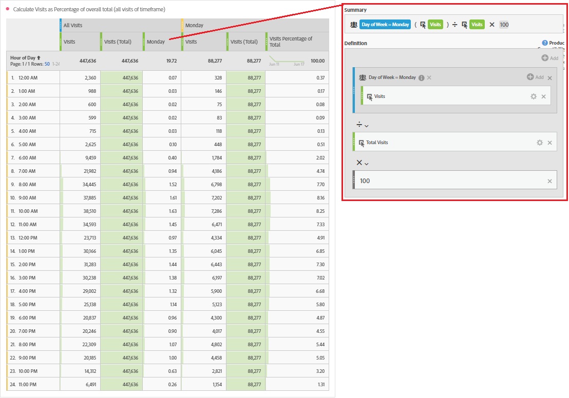
Having this calculated formula (and similar for the other days) in the header columns shows the percentage of visits for a certain timeframe of the week compared to the overall event (eg. “Total Visits”). Now the table with some conditional formatting looks like this:

Looking at this table will show you how the metric is spread troughout the week. And the custom conditional formatting makes it really easy to see where you had the most traffic and where there were almost no visits in this example. Comparing the table with the one created before (daily spread) you can see that weekend traffic turned orange/red. This might be that the users come to our site mainly on workdays while sitting in the office.
Improved heatmap 3: overall spread for all timeframes
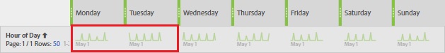
But having the last table you still face a limitation: the calculation is made based on all visits for the single weekdays. That means as soon as you add a longer timeframe, the numbers are just added to the single weekdays without looking if the weekdays are equally spread within the timeframe. For example, if you look at the header row of the timeframe “May 2018”, you can see the small indications just below the column metrics that there were more Tuesdays (5 peaks) than Mondays (4 peaks).
We need to find a way to divide each day by the corresponing amounts of days within the timeframe. To get this number you can just use the formula for “approximate distinct count” and count the number of days that you had in your timeframe. But having only this formula, you have a problem on the breakdown (in the single cell within the table): especially on sites with lower traffic there might be some hourly timeframes where you don’t have hits/visits on every selected weekday. this would lead to a divider which is too low and therefore the result is too high! to get rid of this limitation you need to calculate the “column max” of the “approx distinct count” and hope that at least one timeframe (one single hour of a single weekday) had a hit on everey selected weekday in that timeframe. Sounds really complicated, so I made a new table an added all the different new metrics:

In the table above I made new metrics for Monday and Tuesday while choosing a part of the website with low traffic (I have choosen a low traffic site to be sure that I have some cells with almost zero traffic in a specific hour of a weekday). the first metric for both days “Distinct Count Days” calculated the different days for a certain timerange and a specific day/hour. and since it has low traffic, you can see that the number varies between zero and the desired total days (4 for Monday and 5 for Tuesday). To solve this problem of the filtered data I created a new calculated metric and put the formula from the first metric within a “column max” function. This way I get in all cells the desired number (you still need to hope that there has been at least one hour with hits on every Monday/Tuesday to get the right maximum – but I think it’s ok to live with that…)
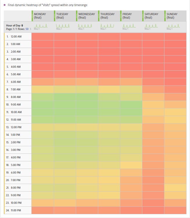
Now we can just add the new formula for the number of days as an additional divider to our percentage metric we created before. Doing this, we will get an average for our percentage value for a single day of the week. But we will face another problem now: the longer the timeframe, the higher gets the number of the days (eg. Mondays) and therefore the percentage gets lower and lower. As a quick fix we just add a new multiplier of the total days for the timeframe. This multiplier is basically the same formula as we created before for a single weekday (but left out the segment for the day). To see the differences I created some more metrics and added it to a table with different time ranges (1 month and 12 month).

As you can see the numbers for the highlighted metrics (with the correction of the days within the timeframe) are in the same ranges almost independant of the selected timeframe. That means whatever the time range is, the result should be within the same range. And this is the final step we need to create the custom conditional formatting which is independent from the timeframe. The final table for the heatmap with overall spread of visits and independant of the selected time range looks like this.
It’s a great start to see when something specific happened on your website spread over the week. And in case you want to do it yourself, just use the calculated metric two pictures above for all the days of the week.
Outlook – my wish for “dependent metrics”
Unfortunatelly there is still one minor drawback: if you want to use anything else than visits as the metric, you need to create new calculated metrics for those events (eg. revenue, time spent on site…). Sometimes you can use a fix as a workaround: if the searched event can only happen once in a visit (or it doesn’t matter how often it happened during a visit) just create a visit segment “desired event exists” and add this segment to the last table above.
While posting the first solution on twitter, Adam Greco mentioned a good idea for further improvement: if we are able to create dependent calculated metrics (eg. by adding two metrics to the table head), it would allow us to create a fully flexible table for every event you want. I hope we get this feature soon – i’ll update this blog entry if something happens 🙂
1 Comment
Pradeep Jaiswal · 2018-06-19 at 7:18 PM
This is very helpful, thanks for sharing detail article Urs.