Creating a dashboards is always like telling a story to the stakeholder. By adding some charts, tables and other visualization to a dashboard you can guide the reader through the data.
Try to arrange the tables and charts on a dashboard in a way that similar topics are grouped together. Just an example: if you have some data about visits, new visitors or similar, it might be nice to have some information from where they found the page. so try to bring that additional information next to the visit data.
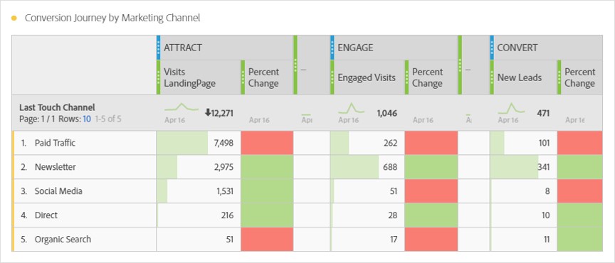
One of the tables i really love is showing full customer journeys from attract to convert. here is a short example how this might look like:
0 Comments