A few days ago I wrote a blog post about creating a heatmap independant of segments and timeframes. At least I thought it is perfect … While adding the table to some dashboards I mentioned some problems with the setup. That’s the reason why I write an Update on the same topic.
Warning 🙂 The following solution for the heatmap is for advanced Adobe Analytics users who are used to create calculated metrics. And to fully understand why I’m doing some of the calculations, I recommend reading the first blog before you continue.
Problem with the “old” heatmap
While I started to use the heatmap out of my template collection, I started to see some problems. First, the heatmap is calculated on the (adjusted) “Total Visits” within the selected timframe. That means every cell of the table is a percentage compared to the total. This percentage heavely depends on how your visits are spread over the week! If the visits are equally spread amongst the days, you will end up with values around 8-12 as a maximum for a single field. But if you have a website, which is strongly influenced by campaigns or weekday effects, this number can increase to a much higher value! The highest I have seen when testing the heatmap was around 25, but I think it is possible that it can go much higher.
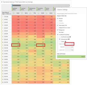
The second problem with the heatmap is the missing option to add the right conditional formatting. Neither the custom nor the automated conditional formatting fully work to use the table as a template for all reportings. When I tried to use the custom conditional formatting it worked really good with my higher mark at 12, but as soon as I had values above, the coloring didn’t show the expected results (see problem above). And when I tried to turn on the automated conditional formatting, it doesn’t worked either. The reason is that the automated conditional formatting is based on each column and not on the whole table. Even if you make the settings on a segment which spans over the whole table, it doesn’t work. You only have the impression that the automated conditional formatting has the right scale, but in fact it only shows the values for the first column. The next picture shows the problem: I turned on the automated conditional formatting and it showed me the marks for the first row (see the higher value on Thuersday). Lesson learned: automated conditional formatting is always isolated for each column!
Those two problems were the reason why I tried to find another way to get the perfect table. Let’s dig into the solution step by step.
Get overall maximum value of the table
To solve the problem we need calculate each cell in a way that every value is on the same scale with a defined minimum and maximum. I decided that I want it to be between 0 and 100 representing something similar to a percentage value. Basically 100 should be the maximum value of the table and all others should be relative to this maximum.
If we are able to get the values in this way, we could add custom conditional formatting with the marks of 0 to 100 and it would always be perfect colored. To achieve this, we need to have the maximum value of the table in our final calculated metrics.
First step is to calculate the maximum values of each weekday. As explained in the first blog post we adjust the values by the corresponding count of weekdays to get a weekday average. The following picture shows how to create this first calculated metric. For a better understanding I added some additional columns to show the single values together with the desired weekday average:
In the next step we create a calculated metric which calculates the overall maximum. The needed function is “row maximum” where you can add as much metric as you want (by hitting “add additional parameter”). When we add all calculated metrics from the weekday averages, we receive the overall maximum! The following table shows the single weekday values (created as shown before) and the new “overall max” on the right side. I even added the metric definition with some remarks but skipped all the single metrics after the first one (it would have been too long for the picture….).
Remark: I didn’t check but I believe you could even save some functions if you exchange the way of the calculation “col max” and “row max”. That means you could basically have a “col max” function containing the “row max” function with all the 7 metrics of the weekdays (instead of the other way round I created the metric here). This might be a little shorter but more difficult to explain ?.
Calculate values on 0 to 100 scale
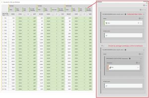
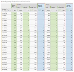
Having our metric (or formula) for the overall maximum value we can now create metrics for each single weekday. To create the new metric, we just need to divide the value of a single cell by the overall maximum (as created in the last step). In the following table I added the overall maximum beside the new calculations for Monday and Tuesday (highlighted columns). And the additional columns (below the “Monday” and “Tuesday” dimensions) are there to check if the calculation is as expected.
While it looks easy to say “divide cell value to overall macimum”, the formula behind a single calculated metric is quite long. Let’s first have a look at the calculated metric summary of the formula as shown in the metric builder:
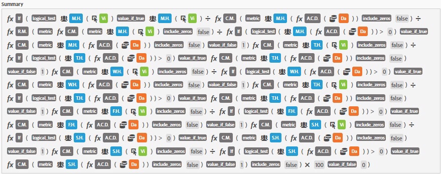
This might be hard to understand (and more difficult to rebuild). I created a new picture out off the metric builder to show you the (almost) full metric. And I even added some explanation which should help you to understand the different parts of the new metric. Remark: as before I skipped some Elements to shorten the picture, hopefully you still understand the formula).
Update: In the final version I added some additional conditions: those are needed because I use a function (distinct count) as divider which can get to zero. And having such a value doesn’t work, as you might know… Therefore I use the “if…then…else” function to check every divider before using it.
As soon as you have done the first metric, just create the metrics for all other days. To get all metrics you just need to exchange the segments in the first part of the metric (and don’t forget to “save as …”). That’s it – you now have all you need to create the heatmap! Just add them all to a single table as in the other examples and add some coloring.
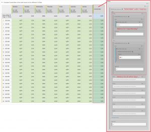
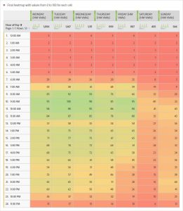
In the picture above I left the numbers visible to see the spread of the values. As you can see all numbers are now between 0 and 100 representing the percentage to the overall maximum. Having this, the conditional formatting is really easy, just turn it to “custom” and add the marks 100,50,0 for top to lowest. To get the final heatmap just turn of any numbers and you recieve the perfect table:
That’s it! Now I can save the table in my template project and use it wherever I want…
Bonus: Use API template for metrics
I know that creating the metrics by hand is a lot of work, but worth doing it. To make it easier for you I created a simple excel: generate the API calls for all metrics for your organization.
Heatmap CalculatedMetric Builder v1
Warning: You do it at own risk! please have some experience using the API before using the calls from this excel! And if you should find any errors or problems, please let me know!
Final question: red or green for top value?
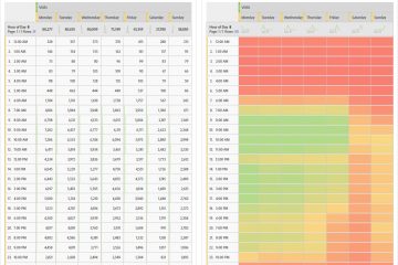
While discussing the final table with some friends we spoke about how to color the table. Why should we use “red” for “no traffic” and “green” for the “top values”? Since the reader get attracted by orange/red more than green, we could invert the formatting. Now we have the red cells representing the top values.
And as a further improvement and to get rid of the green (which might indicate “good”), we could just set the red to -1 and yellow (middle value) to 0 (zero). doing this would create a table with a lot of yellow and red representing the “heavy hours”. What do you think? what might be the “perfect coloring”?



0 Comments